#7 All Gray Road Uniforms

The worst Mariners uniform is the classic MLB all-gray road uniforms. The Mariners have a fairly basic road design, with the “SEATTLE” displayed across the chest to represent their city as the road team in a different ballpark. The shirt underneath the jersey of Logan Gilbert here is a good contrast to the gray of the uniform, but the gray is overall a fairly basic jersey, which is why it lands near the end of the list and is not anything special.
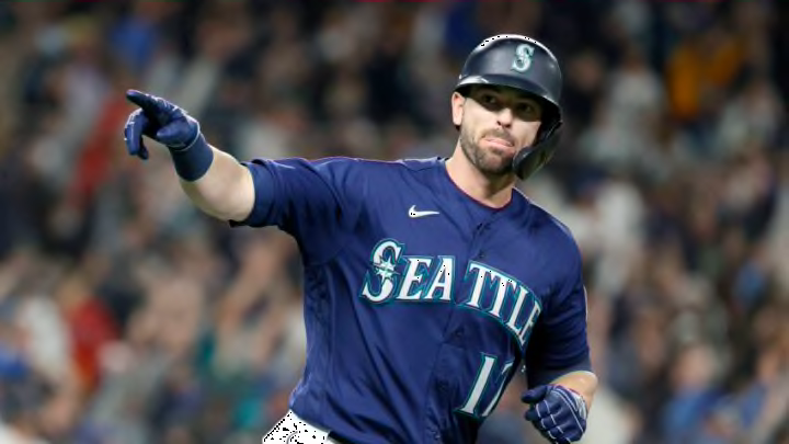
The gray is overall pretty bland and has begun to be phased out a little bit. The team has started to wear the navy blue jersey tops on the road more and more. They overall are just the worst combination the Mariners have. It is just very bland and boring. The Mariners at least add something new when they wear their northwest green or navy blue jerseys on top of the gray pants.
The Mariners gray jerseys are not terrible by any means, but they have better options. I believe they made a good move to start using their navy, and even northwest green, uniform tops on the road to get away from the all gray look so much.
Overall, the Mariners have some pretty nice uniforms. They are not iconic jerseys or the best in baseball, but they are a good representation of the northwest, as the colors and logos are a good reflection of the team and the city. The team should be getting a city edition jersey in the next year or two, which will hopefully be a great set that Mariners fans will love.
