Major League Baseball’s third annual Players Weekend has come and gone and our eyes are saved.
This was a pretty eventful weekend for the Mariners with the promotion of Justus Sheffield, Jake Fraley‘s home debut, and the return of Félix Hernández. But, like with most things with this team in 2019, the good is often outweighed by the bad. And it just so happened that all of this fell in line with the series many Mariners fans dread the most, on a weekend designed to push merchandise and ultimately make baseball unwatchable for 72 hours.
In the past, I haven’t been entirely opposed to Players Weekend. While most of the uniform designs and color palettes over the last two years were horrendous in their right own, they had a sense of charm and wackiness to them that made the weekend palatable at least. But this year’s shift to a league-wide monochromatic style made teams and players feel less distinct and, ironically, washed out.
Players Weekend, in essence, is supposed to afford more creativity to the players, allowing them to sport nicknames on the back of their jerseys and don colorful and vibrant accessories. But it really isn’t about the players and more about trying to capitalize on merchandising in the same vein as the NBA, and the players get lost in it all.
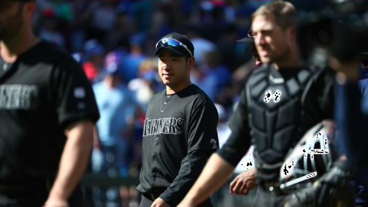
It’s hard to imagine that players and coaches were absolutely thrilled with wearing all-black uniforms in hot August weather. And for those wearing the white renditions of the uniforms, it was impossible to even make out their nickname, number, or team logo, completely defeating the purpose of the whole weekend and its merchandising campaign.
Major League Baseball tried to sell players and fans alike on the idea of personalization, but when your uniform resembles that of 14 other teams, personalization goes entirely out of the window. At the very least, each jersey should have been accented with each team’s primary and/or secondary color.
During the Mariners’ series with the Blue Jays this weekend, it looked as if Toronto wore completely blank uniforms from afar. Now, this wouldn’t have necessarily fixed the issue at hand, but if the grey accents on the jersey were switched to some sort of blue or red, it would have at least made the uniform feel more personal to the team wearing them.
I will say that I’m not too torn up about how the Mariners’ all-black set turned out, mainly because their team colors are very dark and would have clashed even more with the black than the grey already did. But I would have been interested to see a teal logo across the chest just for the sake of individuality.
The league is rightfully getting panned for these design choices, so it seems highly doubtful they’ll return to this style next year, so I’m basically beating a dead horse here. But I wanted to throw in my two cents after being subjected to this ugliness. At least the Mariners rained on the #BlueJaysInvade parade.
